
From the start
Coffee, as an experience, has always occupied a strange tension between objectivity and subjectivity. The industry has worked hard to codify its evaluation systems — cupping protocols, flavour wheels, scoring forms — yet the actual act of tasting remains deeply personal. What registers as “vibrant citrus” to one taster might come across as “overtly sour” to another.
Preferences are polarised. Some gravitate toward bright, washed Ethiopians with high acidity and tea-like texture. Others prefer heavy-bodied, roast-forward profiles with chocolate and char-. Most people sit somewhere in the middle — or shift over time. None of this is inherently problematic.
What is problematic is the persistent difficulty in communicating what a coffee tastes like in a way that’s both meaningful and consistent — especially before it actually gets tasted. If you haven’t built a strong internal flavour reference, or you’re not able to cup coffees side by side, descriptors like “clean,” “funky,” or “balanced” aren’t very helpful. And for anyone situated outside dense urban areas with a strong coffee sharing and cupping community, actually experiencing these coffees first-hand often involves a significant barrier to access — geographical, financial, or otherwise.
What Exists and What Doesn’t
Plenty of attempts have been made to bridge this sensory gap. Each is useful in context — but each comes with limitations:
The Coffee Tasting Wheel
A colourful and elegant reference chart, designed to help trained tasters put names to what they perceive. It's a fantastic vocabulary and sensory builder. But on its own, it doesn't communicate how those flavours interact — or even whether they’ll be perceptible in a given brew.
SCA and CQI Cupping Forms
Rigorous and analytical, the industry standard scoring systems are deeply rooted in calibration. They produce highly specific numbers — body: 7.5, acidity: 8, uniformity: 10 — but with minimal interpretation. Highly useful devices for conveying a coffee’s quality however, unless you’re trained, they read more like lab reports.
Spider/Radar Charts
Used mostly in professional context, these graphs attempt to show flavour attribute intensity. While more visual, they tend to isolate data points without showing how they connect. You can see that a coffee is “high acidity” and “medium sweetness,” but not whether those qualities balance, clash, or coexist smoothly.
Roaster Notes
The marketing copy: “juicy,” “elegant,” “lingering citrus finish.” Occasionally poetic, occasionally vague. Always filtered through someone’s palate — on occasion someone else’s branding goals. Not standardized. Often not reproducible.
Each of these tools tells part of the story. None of them tell the whole story. And none of them — critically — offer an intuitive visual summary of how a coffee feels.
The Coffee Visualiser: Our Proposal
Enter the Coffee Visualiser, anchored by a tool we’re calling the Coffee Visual Curve (CVC) — though we’re open to workshop the name if someone’s got something better.
This isn’t here to replace existing systems like the SCA form or cupping wheels. It’s a translation layer — one that takes what we already taste and sense in coffee and re-expresses it visually, with clarity and repeatable structure. It distils the flavour experience into its primary vectors: Aromatics, Acidity, Sweetness, Body, and Astringency, mapping their presence and relationships across a continuous curve.
Inspiration and Implementation
The CVC is loosely inspired by a concept familiar to those in photography and film: the histogram.
In a camera, the histogram doesn’t tell you what the photo looks like — but it gives you a sense of how it feels. It charts luminance and exposure, highlights and shadows, and whether things are crushed, flat, or balanced. Without seeing the image, you can still make a call: too blown out, too dark, weird contrast, etc.
The Coffee Visual Curve aims to do the same — to let you “read” a coffee’s flavour structure even if you’ve never tasted it. It allows us to approximate:
- How developed or “light” the coffee is
- Which flavour vectors dominate (e.g., punchy acidity vs mellow body)
- How sweet, clean, or jagged it feels overall
- Whether attributes blend together or feel separate
- Whether it’s balanced or lopsided — in an interesting or unfortunate way
We’re not copying the histogram one-to-one, but the metaphor is useful, especially for those familiar with visual media.
How It Works
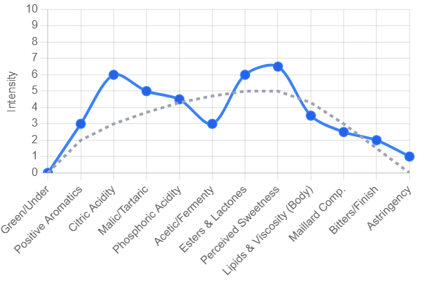
We use a single continuous line (not multiple coloured layers) to represent the curve — simplifying both real-time drawing during tastings and digital generation later. Here's how it breaks down:
- The X-axis represents flavour domains, flowing left to right in this order: Green//Underdeveloped Flavours → Aromatics/Florals → Acidity → Sweetness → Body → Astringency/Overdeveloped Flavours (low-tone, bitter/ashy)This reflects the spectrum from “light” to “dark” perceptions — an intuitive parallel to exposure in a photo histogram.
- The Y-axis measures intensity/saturation on a scale of 0–10. Whilst one may assume ‘5’ to be the supposed medium across all vectors, we will have a dynamic baseline where certain values remain the standard/median, and going above or below suggest deviation from the suggested baseline perception. 0-2 donotes low perceptibility, 3-5 would suggest low to notable presence, 5-8 medium to high notability, values above 8 suggest overwhelming intensity, and can denote disconnect or overbearing presence.
- At baseline, the graph forms a parabola peaking around 5 on the Y-axis, with sweetness in the centre and tapering toward zero at the ends. This represents an “ideal” boring coffee — no clipping astringency, rounded acidity and body, and a prominent fruit sweetness centre.
The goal isn’t to create an artificial perfection metric. It’s to map how any given coffee behaves along these dimensions, and let the curve speak for itself — balanced or imbalanced, round or jagged, bold or clean.
What the CVC Values
To be useful, the CVC has to stand on more than metaphor. Here’s what we’re designing it to prioritise:
Intuitive Visuals
The shape of the curve should be readable at a glance — allowing both professionals and casual drinkers to form a fast impression of flavour balance and interaction.
Standardisation
The CVC aims to provide a structured and repeatable way of expressing sensory data, reducing the subjectivity of traditional notes while still reflecting them.
Linearity with Purpose
Each segment of the X-axis is deliberately ordered and calibrated to match how most tasters experience flavour progression in a cup — from sharp entry (acidity) through sweetness and body to finish (bitterness or dryness).
Relational Mapping
Rather than isolating individual attributes, the curve emphasises how they connect. Peaks, troughs, symmetry, and skew all communicate relationships — whether the coffee flows or fights itself.
Compound Signalling
While not literal chemical analysis, each segment on the X-axis corresponds loosely with recognised flavour-contributing compounds (e.g., acids, sugars, phenols, and polyphenols) for educational cross-reference.
Clarity Over Complexity
No overlapping colour blobs, no bloated infographics. Just a clean, continuous line — readable on a small card or a phone screen, just as easily as a full report.
Accessible Interpretation
We recognise that some upfront explanation is needed — but after that, it should click. A jagged curve with punch citric acidity and a thin body? Might not be your next bag. A bell-shaped balance with a mild body and sparkling acidity? Maybe your jam. You get the idea.
Why?
Let’s be clear: this isn’t about looking cool or reinventing the wheel for the sake of novelty. The Coffee Visualiser exists because flavour communication in coffee is still remarkably clunky — and that has real consequences.
For consumers:
It bridges the often absurd gap between tasting notes and what a coffee actually tastes like. You shouldn’t need to be fluent in “coffee dialect” to know whether you’ll enjoy what’s in the cup. A visual shape is instantly more digestible than a paragraph about elderflower and crisp green apple with a “lingering finish.”
For roasters and green buyers:
It provides a structured, flexible way to represent nuance — not just for QC but for communication. You can express complexity without relying on increasingly poetic metaphors or vague scorecards. It’s marketing that doesn’t dumb things down. And it’s a layer of transparency that helps distinguish storytelling from substance.
For educators and event organisers:
It’s a visual anchor that reinforces flavour memory and sensory understanding. Whether you’re guiding new tasters through their first cupping or trying to help a room full of professionals align on a roast, the curve gives everyone a shared language — even if their vocabularies differ.
Early Implementation and Known Limitations
Right now, we’re looking to implement testing in small tasting groups exposed to a good range of coffees and roasts, collecting as many points of reference as we can. Logging how individuals visualize the same coffee and how they differentiate others. Tasters range from casual drinkers to esteemed Q graders, hoping to prove applicability and comprehension for all palette levels.
We’re not pretending this is perfect. Some challenges are obvious:
- Palate variance: People perceive flavour differently. What registers as astringency for one person might come off as structure or brightness for another.
- Data reliability: The curve is only as trustworthy as the input. Garbage in, garbage curve.
- Overfitting: This tool isn’t trying to replace tasting — it complements it. If anything, it invites more tasting, not less.
- Media difference: From water and temperature to brew method, these variables impact how the end coffee gets represented. So for all upcoming tests we’ll be focused on gathering metrics exclusively cuppings following standard SCA protocol, water is likely the biggest form of variance with this. However with supply and difficulty of standardizing water across multiple locations, simply ensuring water compliant with SCA brew metrics should be suitable. Any noise stemming from variance will have to be considered when reviewing data.
We’ll be designing around these limitations through open feedback loops, collaborative testing, and adaptability. That includes refining the curve’s shape logic, tweaking intensity calibration, and adjusting how attributes are weighted — all in conversation with the people actually using it.
Where This Could Go
This isn’t just a design experiment. The potential applications are real, and frankly, overdue:
- Cupping forms with real-time visual overlays, making sensory data more interpretable
- Online retail tools that let customers filter by flavour shape or intensity, not just origin or roast level
- Roaster profiles that showcase a visual identity for each coffee, beyond taste notes
- Event tools for aligning feedback and starting discussion with a shared visual reference
- Educational kits for sensory training, helping new tasters internalise how flavour attributes interplay
We’re building this to be open-source in spirit, modular in function, and usable in the real world — not just a speculative whitepaper.
Help us out!
We’ll begin implementing tests for the Coffee Visualiser soon, locally here in Sydney at some upcoming events in the community! If you’re in the area come down and join us! If not, we’ll be publishing our blank graphs for you to fill in digitally or on paper at your next tasting. Looking forward to all the submissions and input on this first iteration. There are bound to be pitfalls in this media so feel free to criticize us into oblivion.
We’re also working on a digital interactive visualiser where you can plot intensity values and separation values, then be able to manipulate the curve with altering variables like roast level or profiles to see how these interact with end flavour.
So if you’ve got ideas, criticisms, technical insight, or just strong opinions about what a “balanced cup” should look like — get involved.
Let’s make coffee easier to understand!
By Loud Coffee ·